

_gif.gif)


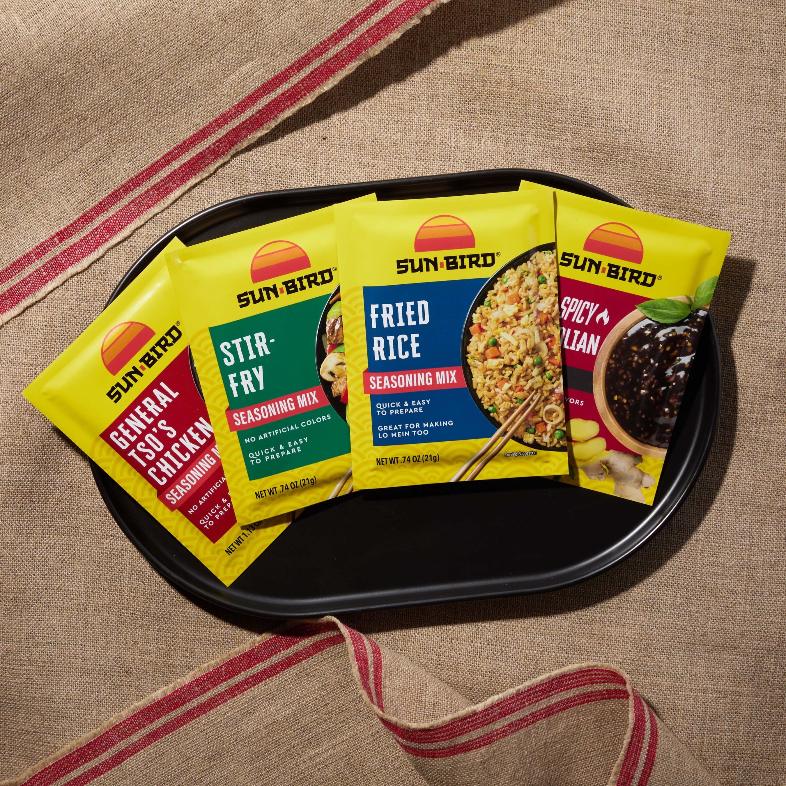
C.H. Guenther & Son has announced a comprehensive packaging refresh for its Sun-Bird® brand, the established line of Asian-inspired seasoning and soup mixes.
Timed strategically to coincide with consumer preparations for the Lunar New Year, the rebrand introduces a modernised visual identity designed to improve shelf visibility and consumer navigability.
Design Architecture and Usability
The new packaging features a vibrant aesthetic centred around a reimagined version of the classic Sun-Bird logo. Key functional updates include:
Visual Hierarchy: A modern design approach intended to "spotlight" the full flavour lineup.
Label Transparency: Clearer presentation of ingredient lists and nutritional information to aid shopper decision-making.
Portfolio Highlights
The refresh covers the brand's extensive range of household staples and speciality offerings, including:
Core Favourites: Beef & Broccoli, Fried Rice, and Lo Mein.
Speciality Profiles: Szechuan Stir-Fry, General Tso’s, and Mongolian Beef.
Clean Label Focus
Aligning with broader health trends, the packaging explicitly highlights "better-for-you" attributes. The brand is emphasising its low-sodium options and clean ingredient decks, noting that products contain no added MSG and utilise simple, recognisable ingredients.
Jeanell Garcia, Senior Category Manager for C.H. Guenther, commented on the objective behind the visual overhaul:
"Our goal was to ensure the Sun-Bird brand visually represents the depth and variety of Asian flavours while inspiring confidence and imagination in every home cook. This new look is more than a design update – it's a celebration of the meals and memories our products help create."


.jpg)

